Interactions
An interaction is where the user’s intention becomes an action. It could be something as simple as a button or as complex as an entire checkout process. Whatever the case may be, the writing should be focused on what’s best for the user.
Titles, headings and subheadings
When writing titles, heading and subheadings:
- Never use periods or other ending punctuation
- Try to be brief
- Titles should be titles, not sentences
Navigation
Menus
Do not use ending punctuation on menu titles or items within a menu.
Links in a sentence
Avoid linking entire sentences. Instead, link only the most relevant portion of the sentence. Use ending punctuation, as normal, but do not include ending punctuation in the link.
Links outside of a sentence
Links outside of a sentence should follow the {verb} + {noun} format. Do not use periods or exclamation points. Question marks are fine within the context of a forgotten password link. Otherwise, avoid using them.
External links
Links that go to other websites must follow best practices such as opening in a new tab or window and including the external link icon () at the end.
For more stories like this one, check out the BigCommerce Blog (opens in a new tab).
Actionable items
Buttons
Users should know exactly what will happen when they click. Button language should be unambiguous, direct and action-oriented and 3 words at most.
-
Follow the {verb} + {noun} formula
-
Use sentence case and never include ending punctuation
- Learn more
- Start trial
- Save settings
- Customize dashboard
- View more
- Add new
- Create channel
Information patterns
Help text and tooltips
Help text and tooltips provide additional guidance to users when completing an action.
- Link to relevant Knowledge Base articles whenever one exists
Placeholder text
Placeholder text inside a form field should be short and have no periods. If it needs a period it’s too long. Keep in mind, placeholder text disappears when the user starts writing and if it’s too long to remember the user will need to delete what they’ve written to see the placeholder again.
If you’ve got a lot to say, present the info outside the field as help text.
Empty states
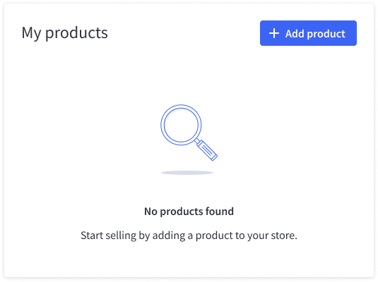
Copy for empty states should tell the user why the field is empty and tell them how to start adding items.

Deprecation
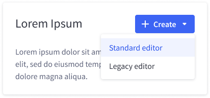
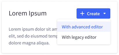
When deprecating an older feature it’s important to set the right tone. Calling the new version of the feature “advanced” makes it sounds harder to use. Calling the feature “new,” while true, also implies the feature is unproven. Instead, if a user has a choice between an older, deprecated version and a new version, just call the new version by its name — without any fancy adjectives.


Common flows
Checkout
When writing about the checkout process, follow established patterns. Ecommerce has been around long enough that users have strong expectations about what the process should look like.
- Add to cart
- Check out
- Check out securely
- Go to checkout
- View cart
- Edit cart
- Confirm payment
- Place order